Loanworks
Fintech Application Design
Project Time
August 2022 - March 2023
Role
Digital Design Lead
Service
Research
UX/UI Design
Prototyping
QA Testing
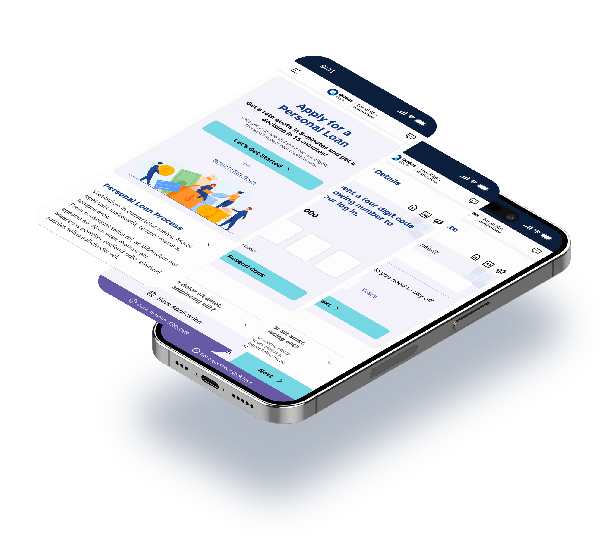
Disruptiv Digital partnered with Loanworks, a tech solution provider in the lending space, to create an innovative application solution, simplifying the loan process for consumers and reducing administrative burdens for businesses in lending.
The aim was to also white-label the new solution to market to their own clients.
Challenges
Loanworks have been creating technology solutions that benefited homebuyers and the mortgage industry alike.
I uncovered and resolved the following challenges during the project:
Understanding the world of lending
Conducting extensive research to understand the complexities involved in loan applications and translating the information needed into a user-friendly experience.
Staying compliant to the rules
Ensuring compliance with mortgage/loan regulations while maintaining appeal and aesthetic in the design process.
A whitelabel product
Crafting a system that can be adaptable for diverse clients and that all user journeys are synchronised with minimal customisations needed.
Integration & Technologies
Comprehensively understanding the necessary technology and centring the design process around it to guarantee a seamless customer experience.
Exploring all possibilities and ensure coverage of all aspects
Investigating diverse lending institutions, spanning major banks to niche providers, to deeply grasp their loan application procedures. Engaging in thorough research to ensure a comprehensive understanding and exploration of all potential scenarios.
Synthesising research insights to pinpoint areas for improvement and innovation in the solution.
Key Findings:
- Loan applications demand extensive user input for lenders to assess borrowing capacity effectively.
- Lengthy loan applications can overwhelm users.
- Clunky interfaces with dense text can lead to user confusion and misunderstanding of critical information.

Filling in the missing user journeys
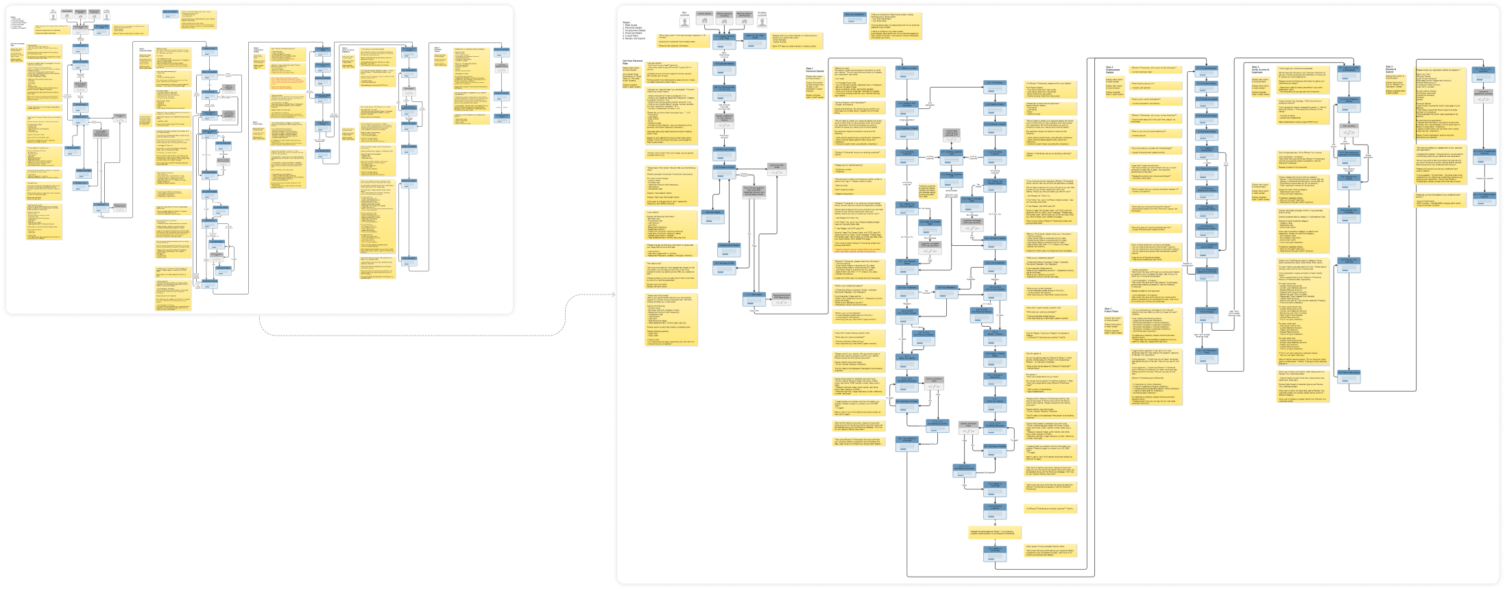
Identifying omitted user journeys revealed by the research, incorporating checkpoints to ensure compliance with lending regulations.
I proposing a UX workshop to optimise collective skill sets, leveraging the client's expertise while prioritising user needs in the design process.
Wireframes
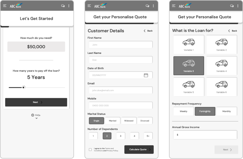
Leveraging insights from research, regulatory requirements, business goals, and user needs, I initiated the wireframing process for diverse user journeys. Employing various layouts to enhance user engagement and iteratively evolving designs to streamline information presentation for better usability.
During the project, I maintained open communication with developers and clients throughout the design process to ensure alignment and facilitate adjustments as needed.
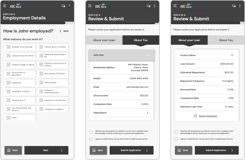
Staying compliant with the rules
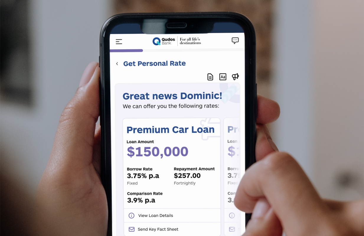
Ensuring application compliance with lending laws, including rigorous content requirements to inform consumers comprehensively before submission, examples include:
- Exposing loan rates and comparison rates prominently.
- Providing a fact sheet with core information displayed on-screen.
- Integrating FAQs throughout the application for clarity on common loan terms.
Throughout the project, I aimed to harmonised compliance mandates with user-centric design, ensuring vital questions are seamlessly integrated while optimising the user journey. Incorporating intuitive features like permission prompts for accessing personal data enhances user trust and transparency. Integration of Illion for bank statement scraping adds efficiency, while leveraging the phone camera for ID photo capture enhances convenience and usability.
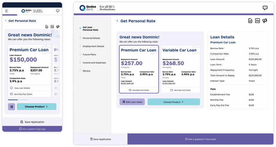
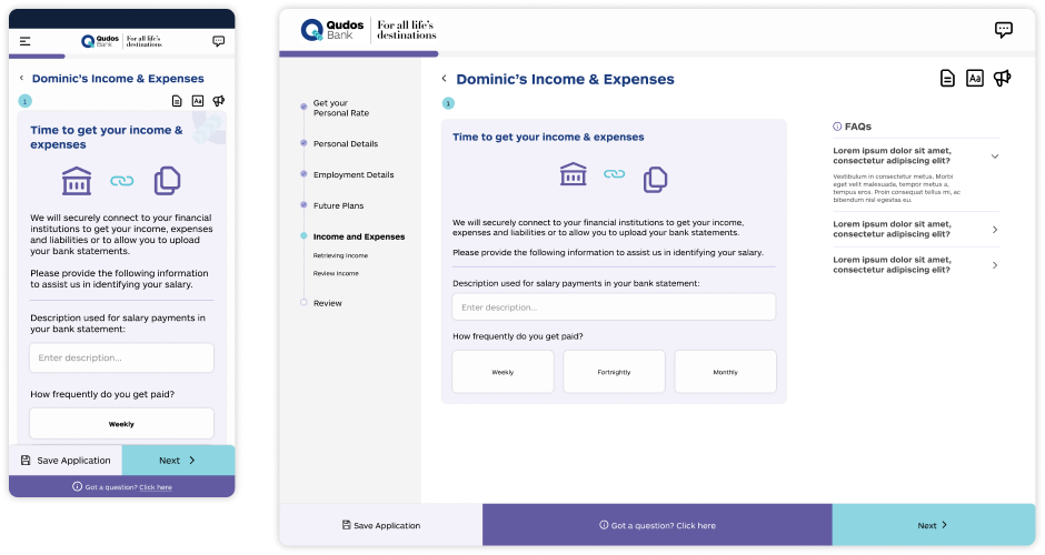
A robust design system
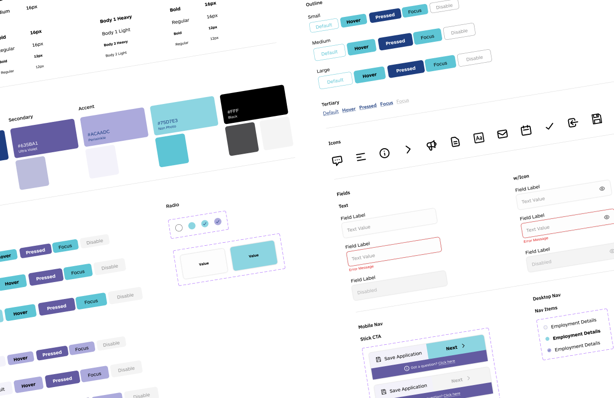
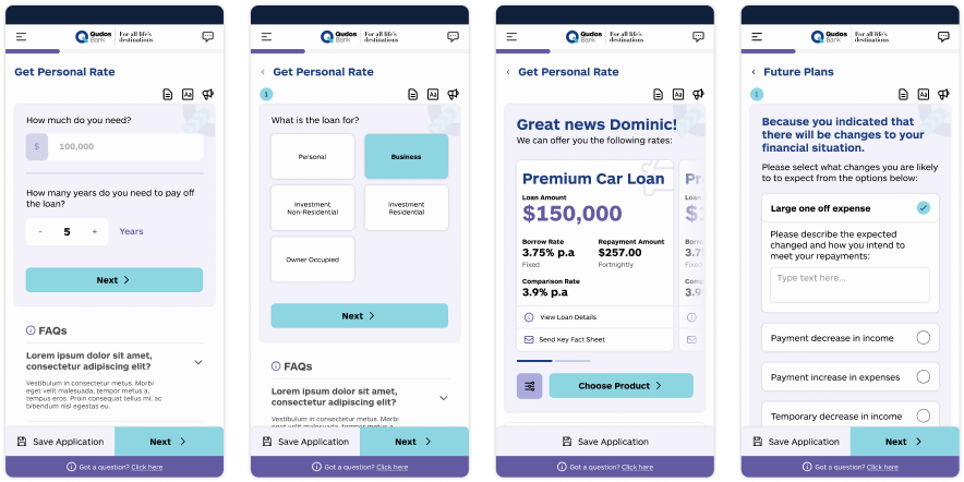
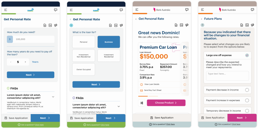
Developed a versatile design system for Loanworks, ensuring adaptability to diverse client brands and requirements.
I proactively created new interface components to accommodate diverse question formats and enhance user interactions. Emphasised accessibility considerations to ensure inclusivity and user-friendliness, especially for individuals navigating through extensive forms with varied content.
Prototyping & Testing
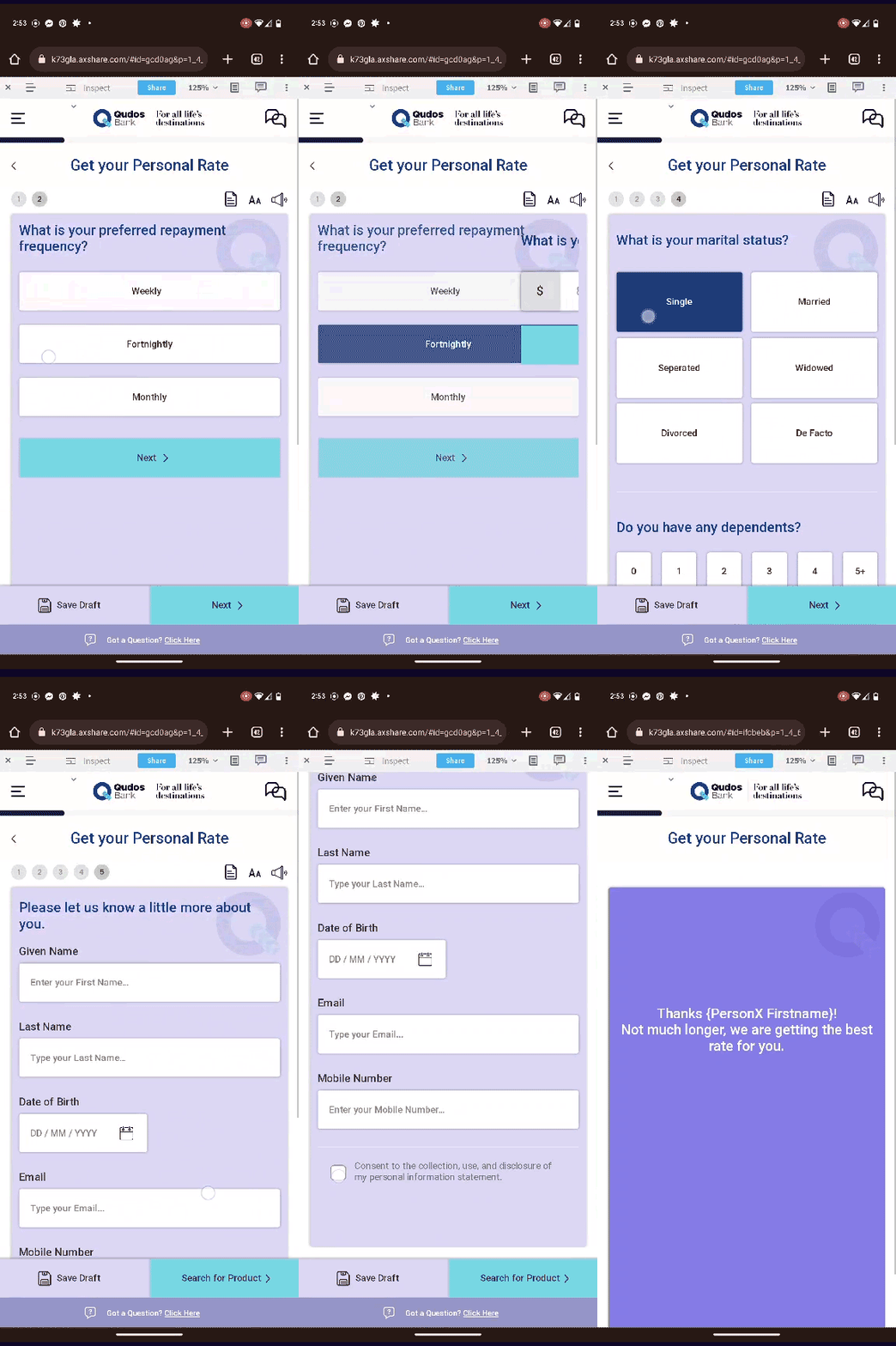
Our aim was to gather feedback to validate the design of the user experience, identify any usability issues, and gain insights into user interactions with the application compared to similar products in the market. Conducted usability testing with Newcastle Permanent involving 13 users, resulting in a generally positive response and a System Usability Scale (SUS) score of 79.4.
Based on findings, key recommendations were provided, such as reformatting content for enhanced trust, adding necessary details on loan pages, and rewording certain content to improve user clarity and progression. Subsequent adjustments were made to the design in line with these insights.

Learnings
One significant insight gleaned from this project was the client's strong visual orientation. Understanding their preference for visual cues prompted me to adopt a proactive stance from the project's onset, ensuring early alignment with the user journeys.
Reflecting on this, I realised that preemptively addressing alignment could have optimised the design phase, allowing for smoother integration of feedback during the high-fidelity design stage.
